 Menu
Menu 


As we’re more than halfway through 2013, awards are starting to come out for some of the best designed websites so far in 2013. We’ve noticed 7 distinctive trends occurring so far in 2013 that are worth mentioning and considering for your next web design project.
1: Responsive Web Design
More and more visitors to websites are coming from mobile devices. We took an average of 5 of our clients at random to analyze their website traffic from mobile devices in 2012 vs 2013 and found the following:
2012 Traffic By Device (Average Across 5 Random Clients)
77.63% Desktop
16.02% Tablet
6.35% Mobile
2013 Traffic By Device (Average Across 5 Random Clients)
66.7% Desktop
23.35% Tablet
10.93% Mobile
We’re seeing an enormous shift towards mobile devices, and we have to accommodate these devices through smart web design. Rather than build separate mobile and tablet sites, we can make use of responsive web design — websites that scale differently depending on the screen size of the device accessing them.
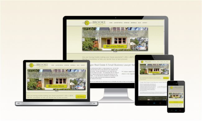
We just finished a beautiful new website for Brooke Law Office in which we implemented a responsive design to aid mobile and tablet visitors in easily navigating to the info they’re looking for on the site.
2: Fixed Header Bars
Fixed headers allow us to leave part of the page content with you as you scroll down the page. Whether it’s the entire navigational menu or just contact information with a call to action, fixed header bars are becoming more and more popular and allow us to constantly remind the site visitor of what we want them doing on a website.
For an example, simply look up! Our site currently has a fixed header bar that we put in place in mid 2012. This bar has helped keep our phone number and important links handy no matter where someone is on the page.
3: Large Photo Backgrounds
Some sites are now starting to use full-width photos as the homepage background, others are opting for a full width slider on the homepage.
We’re in the process of working with a client on a website with no scroll bar on the homepage and a slider full-page background that cycles through various images. We’ve also worked with clients in the last 6 months on developing sites that have full-width sliders on the top of the page to showcase their images. The downside of being so photo-based is that it often leaves little room for content and can be more difficult for organically ranking the homepage in search engine results.
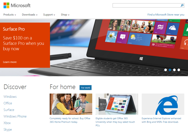
4: Metro Designs
Metro design is a trend started by Microsoft that focuses on a more one dimensional, simple website with a focus on great content. This less is more approach to design is popping up all over the web and is a great option for responsive sites as it’s easy to scale content and design size to fit any device.
This design is also utilized in the Windows 8 “box” interface.
5: Circular Design Elements
For a while we were seeing tons of shapes being used as design elements, however in 2013 the circle seems to be the most popular shape. From icons to callouts to pictures, circles seem to be popping up all over the web.
This trend is also transferring over to smartphones; we’ve seen dozens of new apps coming out with circular buttons and interfaces incorporated into them.
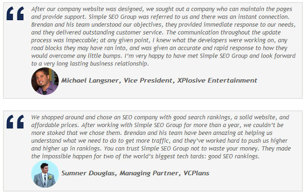
As an example, we recently changed our testimonials page to incorporate circular photographs of our clients:
6: Retina Support
Since Apple introduced the Retina display on their iPhone a few years back, more and more devices including everyday computer screens are becoming higher resolution and having more dots per inch (DPI).
As such, graphics need to be crisper, clearer, and higher quality than ever, and we’re seeing more and more web design shift towards having retina support incorporated into them. This means coding the website so it detects the device display type and delivering the appropriate image to Retina displays vs. standard displays.
7: A Focus On Content
For so long, web design focused on creating the latest and greatest masterpiece. Today, companies are becoming smarter and realizing a website isn’t a work of art to display in a museum but rather it needs to be as functional as possible and deliver great content.
The entire structure of sites is changing as we move away from pre-designed pages and get into template based pages that are easily changed by content managers and easily added to. The very makeup of websites is shifting quickly towards template based pages to enable content writers and site administrators to easily add more and more content to the site without having to call in a designer or developer.
While there’s plenty of other trends happening in 2013, these are the 7 we believe are the most important and most likely here to stay for some time. Of course as time progresses and technology evolves, we’ll see new trends starting to develop, however many of the trends we’ve mentioned above will soon become the standard in web design.